

Key takeaways
- Choose your party color scheme by starting with the occasion and the venue, then limit yourself to two or three main colors plus one neutral.
Choose your party color scheme by starting with the occasion and the venue, then limit yourself to two or three main colors plus one neutral. That simple constraint keeps decorations, tableware, and balloons looking planned instead of random.
The trouble is that party aisles and online catalogs offer hundreds of shades, and it is easy to end up with six near-matches that clash under real room lighting. The steps below turn color selection into a short series of decisions you can finish in one sitting, whether you are planning a toddler birthday, a retirement dinner, or a holiday get-together.
Start With the Occasion and the Room
Before you pick a single color, answer three questions. What is the mood: playful, elegant, cozy, or bold? Who is the guest of honor, and do they have a favorite color or theme? And what colors are already in the room, such as walls, floors, and large furniture?
Existing colors matter because you are decorating on top of them. A bright yellow room fights with a pink and orange palette, while the same room can happily carry navy and white. If you cannot change the room, pick colors that sit next to it on the color wheel or contrast cleanly with it.
Build the Palette With a Simple Formula
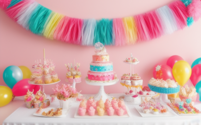
A reliable structure is the 60-30-10 split. Use a dominant color for about sixty percent of your decorations, a supporting color for thirty percent, and an accent for the last ten. A neutral such as white, cream, black, gold, or silver can sit alongside and does not count against your limit.
Pick the dominant color
This color covers the biggest surfaces: tablecloths, backdrops, and the largest balloons. Choose it first and make it the one that best fits the theme. Deep colors read as formal, soft pastels as gentle and celebratory, and saturated brights as energetic.
Choose a supporting color
The second color adds depth to the first. Good pairings include colors that are neighbors on the wheel for a calm look, or opposites for a high-contrast look. Navy with gold, sage with blush, and teal with coral are examples of combinations that tend to balance well.
Add an accent and a neutral
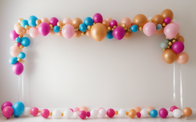
The accent is the small pop: napkins, a few balloons, or the cake topper. Metallics work well here because they catch light without competing. A neutral helps the palette rest, so hold a roll of white or kraft paper tablecloth in reserve if things get too busy.
Match Palette Styles to Party Types
Different events invite different color logic. This table is a starting point, not a rulebook, so treat it as a source of ideas you can adapt to your own taste.
| Party type | Palette idea | Mood | What to avoid |
|---|---|---|---|
| Kids birthday | Two bright colors plus white | Fun and energetic | Five or more competing colors |
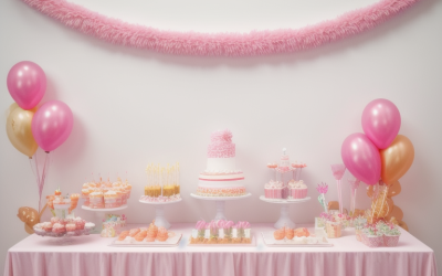
| Baby shower | Soft pastels with a metallic | Gentle and welcoming | Overly dark accents |
| Milestone adult birthday | Black, gold, and one jewel tone | Polished | Cheap-looking neon |
| Graduation | School colors with white | Proud and simple | Mixing in unrelated shades |
| Holiday gathering | Traditional pair plus metallic | Festive | Too many shiny finishes at once |
| Garden or outdoor party | Earth tones and one floral shade | Relaxed | Colors that vanish against greenery |
Check How Colors Behave in Real Conditions
A swatch on a screen or in a catalog does not tell you how a color looks at 7 p.m. under warm lamps. Warm light pushes whites toward yellow and can turn some blues muddy. Cool daylight makes pastels look washed out.
Where possible, order a small amount first, or compare items side by side at home in the room where the party will happen. Hold plates, napkins, and a balloon against each other and see if the shades truly belong together. Matte and glossy finishes of the same color also read differently, so keep finishes consistent where you want a clean match, and use shiny pieces deliberately as accents.
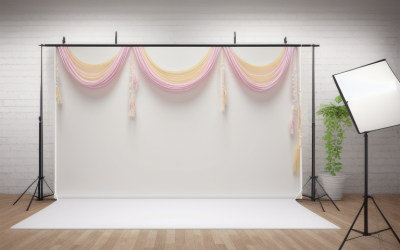
Photographs matter too. If you want a good photo backdrop, remember that a busy pattern will compete with guests, while a solid or softly textured backdrop makes clothing and faces stand out. Think about what people will wear. Guests in dark clothing look great against light backdrops, and vice versa.
Before You Buy Checklist
- Name the mood in one word before looking at colors.
- Note the room’s wall, floor, and furniture colors.
- Choose one dominant color, one supporting color, and one accent.
- Add a neutral or metallic to tie everything together.
- Compare shades side by side in the actual lighting.
- Buy matching items from the same product line when possible, since shades vary between makers.
- Keep a swatch photo on your phone while you shop.
Common Color Mistakes to Skip
The most frequent problem is using too many colors at similar weight, which makes a room feel noisy. Close behind is mixing shades that are almost the same but not quite, such as two different blues that look like a mistake rather than a choice. Either commit to a true match or pick a clear contrast.
Another trap is ignoring food. A dessert table in an amber and brown palette hides colorful treats, while a table that is too loud can make the food look dull. Let the food supply some of your color, and keep the decor around it quieter. Finally, resist adding a new color late in planning. If you must add something, make it a neutral or a metallic so the palette stays intact.
Carry the Palette Through Every Detail
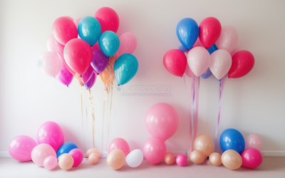
A palette only works if it shows up in more than one place. Repeat your main colors in at least four categories: table linens, balloons or paper decor, tableware, and one wearable or edible element such as cupcake frosting or a sash. Repetition tells the eye the choices were deliberate, even when the individual items are simple.
Vary texture and finish to keep a limited palette from looking flat. A matte tablecloth, glossy balloons, a metallic garland, and a tissue paper pom-pom in the same color family each reflect light differently, so the room feels layered without adding a new hue. Natural materials such as wood, greenery, and woven baskets act like neutrals and soften strong colors.
Think about sequence as well. Guests notice the entrance first, then the food, then the seating, so make the strongest color statement at the door and let the rest of the room support it. If the venue has fixed items you cannot change, such as a bright rug or patterned curtains, pull one color out of them and repeat it in a small accent so the room and the decor look connected instead of competing.
A Quick Way to Finalize Your Choice
If you are still undecided between two palettes, make a small mood board. Place a napkin, a balloon, a candle, and a piece of fabric in each candidate palette on a table and photograph them side by side in the room. Look at the photos the next morning with fresh eyes. The palette that still feels calm and cheerful, and that makes the food and the guest of honor look good, is usually the winner.
Ask one honest friend for a quick reaction as well. A second opinion catches clashes you may have stopped noticing.
Related guides
- How To Hang Streamers And Backdrops Without Damaging Walls
- How To Fix A Christmas Light Strand That Is Half Out
- How To Wash A Light Up Ugly Christmas Sweater
Frequently Asked Questions
How many colors should a party have?
Two or three main colors plus one neutral is a safe range. Fewer than that can feel flat, and more than that usually looks chaotic unless you are going for a rainbow theme on purpose.
What if the guest of honor loves a color I dislike?
Use it as the accent rather than the dominant color, and pair it with calming neutrals. A little of a bold shade goes a long way, and the guest of honor will still see their favorite on display.
Do metallics count as a color?
Treat gold, silver, and rose gold as accents or neutrals. They tie the palette together without adding another hue, which keeps the design simple. Use one metallic rather than mixing several.
Should I pick colors before or after choosing a theme?
Pick the theme first, then build colors from it, since the theme suggests natural shades. If you have no theme, start with the venue and the guest of honor, and let the palette become the theme. Either route works for a polished 2026 celebration.
More from Amazon
Programs that pair well with the guide above. Offers and eligibility are set by Amazon and may change.
Free shipping on eligible items, Prime Video and more. Eligible new members can start with a free trial.
Start a Prime free trialAudiobooks and podcasts to listen to on the go. Eligible new members can start with a free trial.
Try Audible freeAd-free music streaming. Eligible new subscribers can start with a free trial.
Try Music Unlimited freeA free business account with business pricing and bulk-buying tools for work, shop or home office.
Create a business accountAs an Amazon Associate we earn from qualifying purchases.

Write Your Review
No reviews yet. Be the first to share your experience!